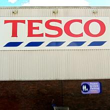
Tesco's application to erect 82 illuminated and non-illuminated fascia, canopy and flag signs on and around its 7, Broughton Rd supermarket has been consented (Ref. 13/00540/ADV; Breaking news, 5.3.13).
One Logie Green Road resident wrote in to object, citing among other reasons potential loss of amenity and distraction to drivers:
'My objections are to any additional external signs or flags visible from Broughton Rd as they will be an unnecessary distracting eyesore and a distraction to passing traffic near the pedestrian crossing.'
He went on to assert that the real reason Tesco want more signage is:
'[...] to start a promotional display war with a potential new low cost competitor who has shown interest in moving into a new development in 11 Logie Green Rd. The people of Boat Green, Logie Green Rd, Broughton Rd and any passersbys in Rodney St are to be subjected to a visual assault by Tesco attempting to pre-emptively blitz the competition.'
A Council Planning officer responded only to the first two points. He found first that the:
'[...] size and position of the new advertisement signs, on the buildings, the directional signage within the car park and the gantry sign adjacent to Broughton Road and the means of illumination and materials are appropriate to the character and appearance of this modern retail building'.
All this seems to imply that once a building's character and appearance exceed some (unexplained) threshold of ugliness, things cannot get any worse. Some would beg to differ.
The officer also found that the new signs were 'unlikely to be any more distracting to motorists than the existing advertisement display on the building or other elements of the surrounding built and natural environment ... There are no public safety issues'.
Consent was therefore recommended and granted.
The Council's response in the case is no doubt procedurally correct. But for the many locals who find supermarket signage gaudy, obtrusive and largely unnecessary even in non-World Heritage sites, the Planning mindset behind it is disappointingly flaccid.
It not only fails to try and improve the area but doesn't even see the point.
Thus are we all condemned to mediocrity.
What do you think of Planning policy – too hard or not ambitious enough? Tell us by email: spurtle@hotmail.co.uk Twitter: @theSpurtle Facebook: Broughton Spurtle
***************
Reactions on Facebook
- Robin Gillanders Yet again find myself in complete agreement with Spurtle. They would do well to improve the appalling signage inside the shop where you can never find what you are looking. I've complained of course...


